print & poster campaign
Client: Amazon
TASK: Show off the light and VERSATILE nature of the product in the context of it's common usage: in newspaper/magazine ads & subway commuter space.
The original Kindle's qualities were tough to match. It was a new type of wireless product, battery-rich, store connected, and filled with up to 1500 books. With all of these unique features and it's mass appeal, the Kindle was ready to sell. White space and a minimal design approach complimented the Kindle's housing and philosophy. My goal was to extoll it's impressive features while showing off it's smallness— it's ruggedness— and it's modern aesthetic.
Newspaper & Magazine ad
This ad ran in dozens of newspapers and magazines. It was part of the original launch push. In it's ideal proportions the hand was life-sized. You could place your hand over the hand in the print and see exactly what it would like to hold a Kindle in your own palm. This reinforced how compact the Kindle is.
Accordion print piece: front
An accordion print take-away provided a secondary experience, and gave more specific details on the Kindle's attributes.
Accordion print piece: back
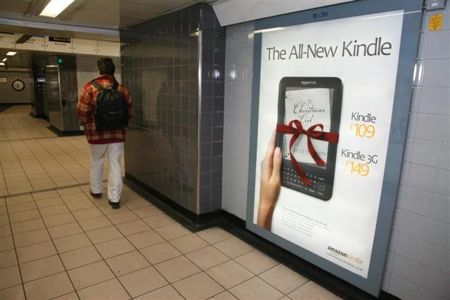
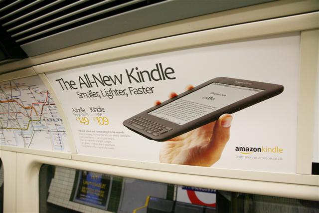
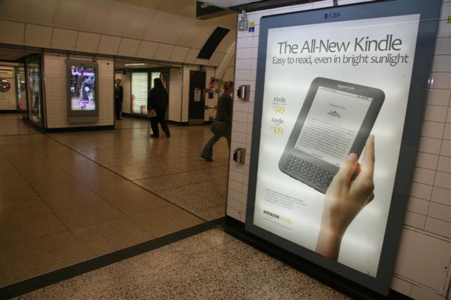
Subway Poster campaign
Ironically, one of the the best ways to show off the svelte profile and light weight of the world's best-selling eReader was through large format posters. This was a smart ad buy. The primary demographic for this product walked by it potentially every day, and many would envision a better commute: "travel to work with every book in your library. "
Kindle at this scale not only gets a huge amount of eyeballs, but also juxtaposes it's small stature alongside large poster prints.
Kindle was pretty young when this campaign went live. It was difficult to see what the future of the eReader would be. In hindsight, it's obvious that Kindle and other eReaders would find their own positioning and place within the market. I think smart branding was a deciding factor in Kindles' success.


